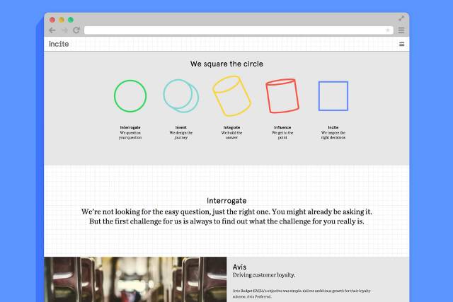
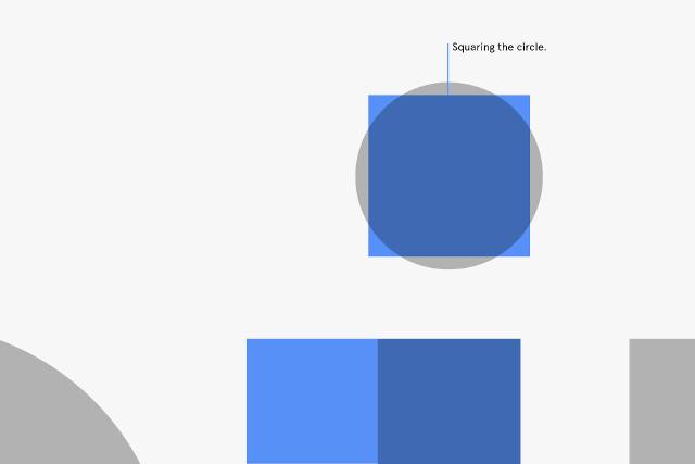
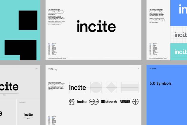
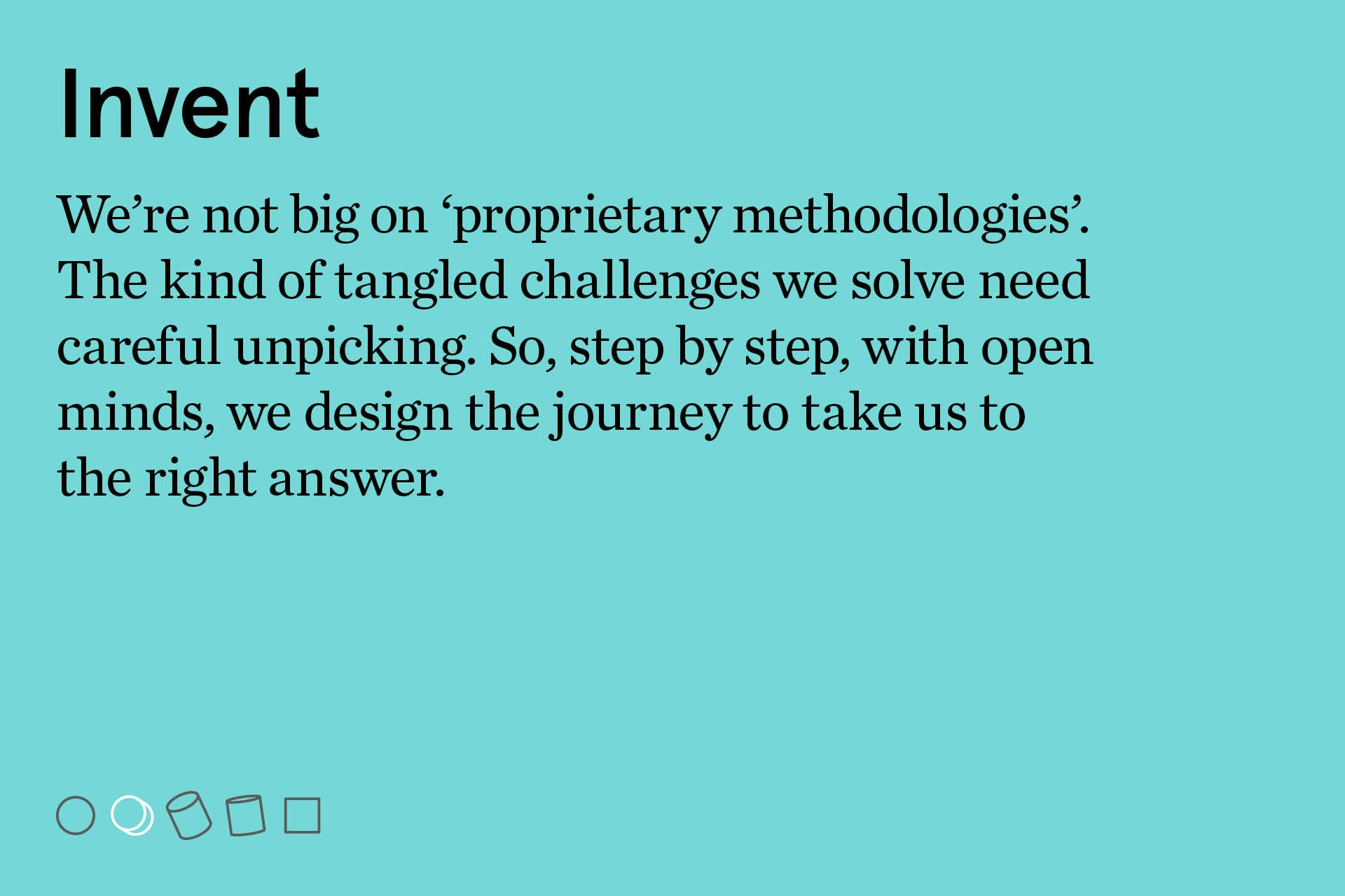
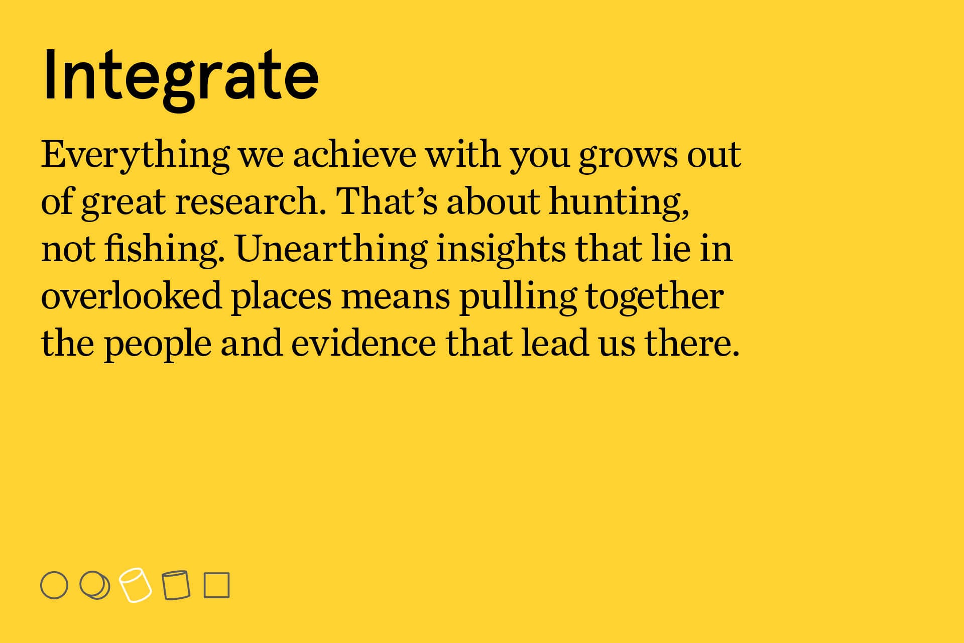
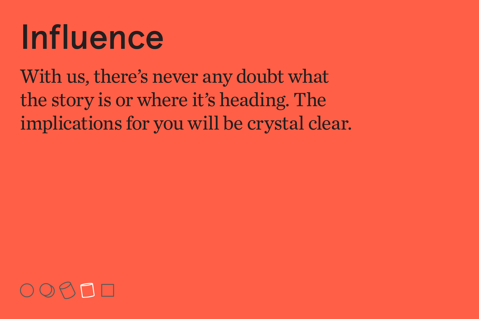
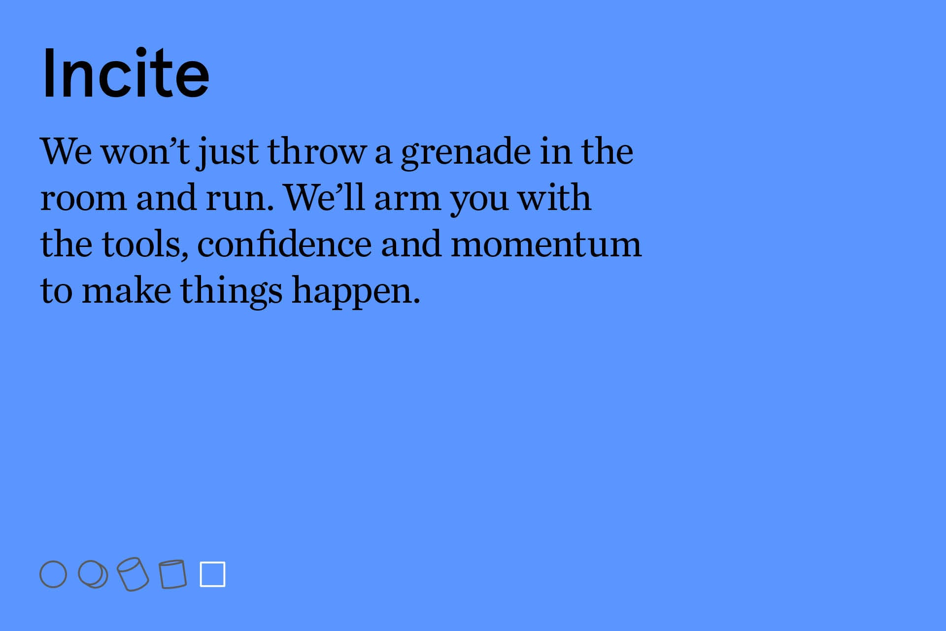
Incite is a strategic research consultancy that thrives on helping clients with tricky problems. And so the core of the identity communicates what they do: they make the complex simple and inspire the right decisions. 'Squaring circles' is executed as both an animation and as five shapes or icons. Each icon represents a phase of Incite's consultative approach.

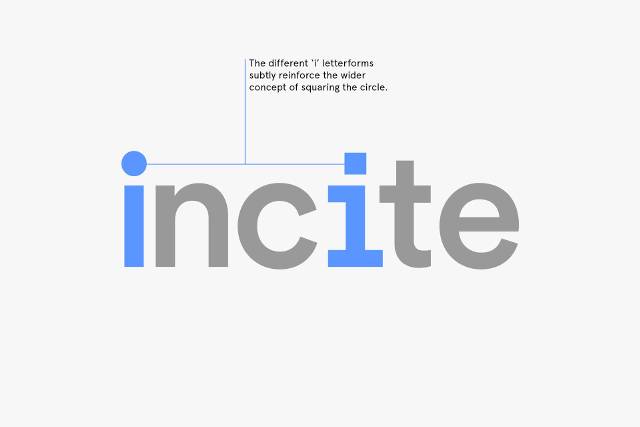
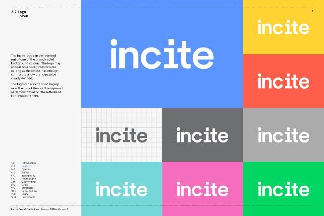
The wordmark subtly reinforces the same message: the dot (or tittle) of the first 'i' is a circle, the second 'i' a square. In an otherwise san serif word mark, we also introduced a slab serif on the second 'i', to give the logo subtle visual intrigue and make it distinctive and ownable. The two different 'i' forms play nicely to the wider identity and can be read as a gentle nod towards the two complementary sides of the business - drawing equally on qualitative and quantitative research techniques.

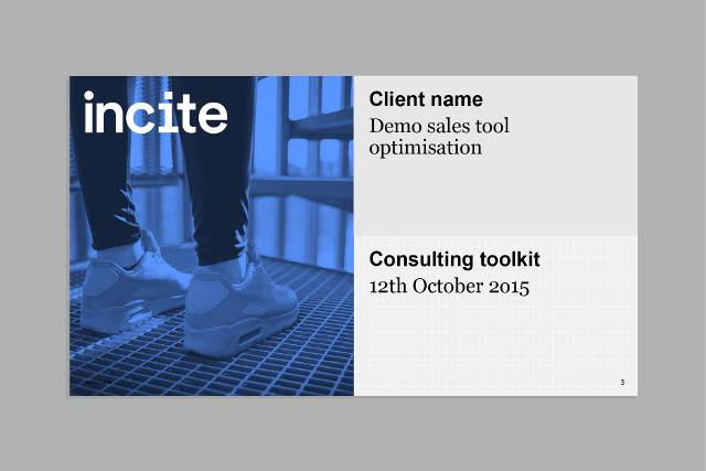
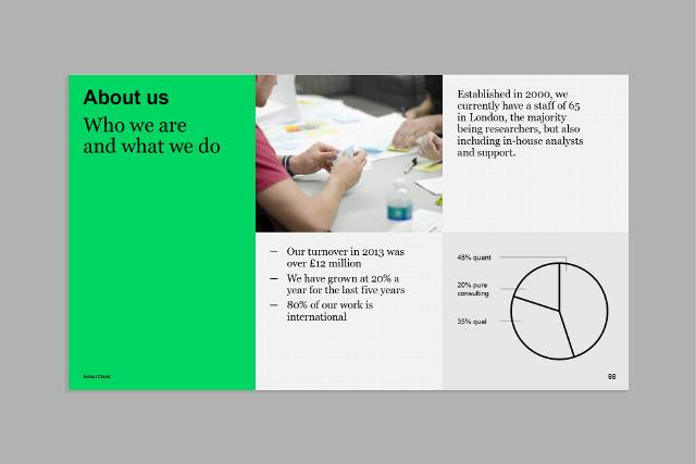
The requirements: Incite needed a layout which worked across the widest range of formats and could be effectively used by 100 senior consultants with varying levels of skill. So we kept it simple. We built an easy to work with grid. Slides are divided into halves, quarters or thirds; both vertically and horizontally. These became the building blocks for the visual language.


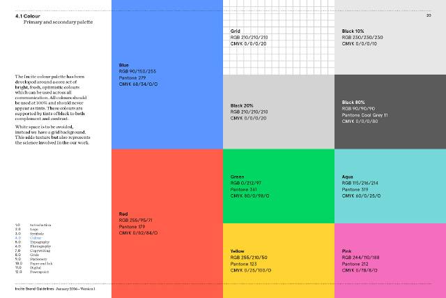
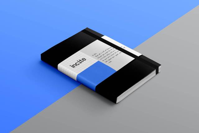
Making every piece of communication feel unmistakably ‘Incite’ was our brief. We wanted a visual tool to underpin all the other elements, and so again we drew on the distinctive combination of qualitative and quantitative research techniques in which Incite excel. The graph paper motif blends a nod towards a data-led, or a ‘quant’ approach, with a softness of application; something reminiscent of old school note pads that syncs with the more human-centred approach of qualitative research. Friendly data if you will.
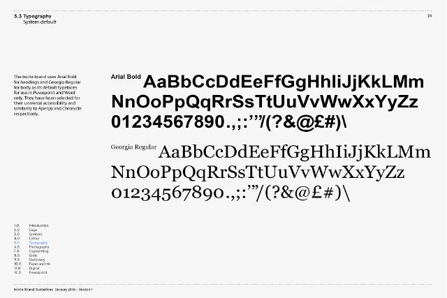
The centrality of PowerPoint to Incite’s communication limited us to system fonts for this element. The key was to find a distinctive font pairing for the other applications so that everything sat together seamlessly. The Incite headline typeface is Aperçu Bold, selected for its intelligent geometry and beautiful craft; and the body face is Chronicle Text Roman, a great hybrid of time-honoured forms and contemporary design.
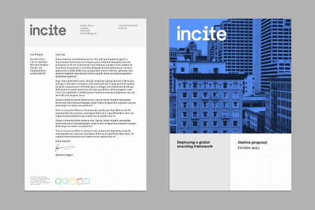
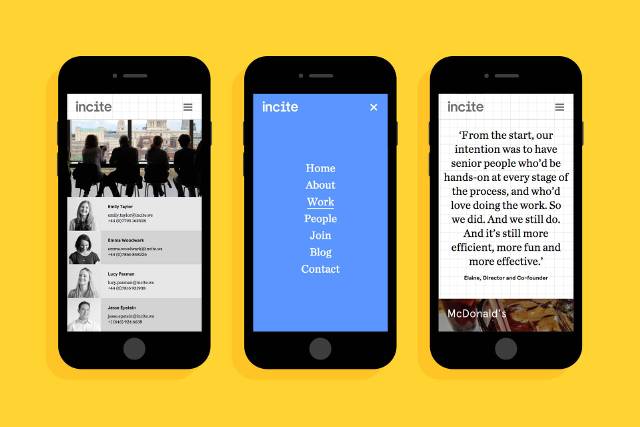
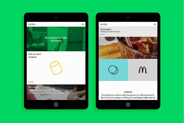
As well as delivering a strategically underpinned visual identity we worked to ensure that tone-of-voice and copywriting were fully aligned. We started with a set of three-tiered descriptions to explain Incite's way of working: five IN words, supported by a short descriptive sub-line, each with a longer-form description that digs a little deeper. We worked on copy for the new website and an all new set of project case studies. The guiding principles for the approach to copy are clarity and brevity. Everything we did in the creation of templates and the site design is geared towards encouraging this way of thinking and communicating.
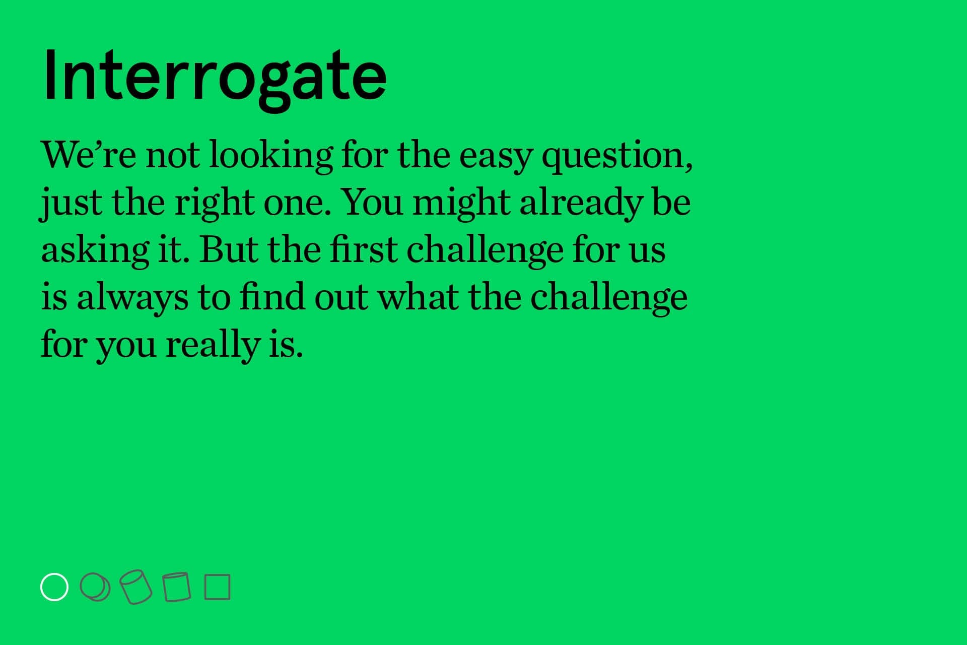
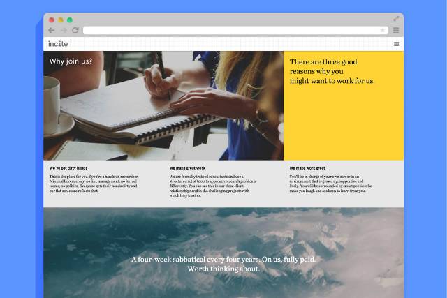
The beauty of the modular grid system is that it works across all formats and at all scales. As with other applications the design supports the desire for a copy style with clarity and brevity.